4 months | 2022 | Team of UX Designer, Researcher, Engineer
The data was there, they just couldn't see it
Xenial’s back-of-house solution lets enterprise restaurants manage reporting, inventory, and labor costs.
Our internal customer support team team uses it to connect remotely and troubleshoot restaurant point of sale terminals for our customers. This was a small piece of a larger project to make data visible and actionable.
Disclosing errors to improve customer support
I collaborated with my UX team to disclose error data that is already being collected, but is not visible to support agents. We had previous research to guide our solution, we conducted additional research to validate our idea, and refine the solution.
Showing more error details up front makes the system more cohesive, provides a better user experience, and eases frustrations caused by software malfunction.
Goals
Users: Xenial support specialists want to be able to troubleshoot POS issues remotely without relying on a store cashier to explain problems to them over the phone.
Business: Xenial wants to improve the customer experience by reducing support call frequency and duration.
Design: We want support team users to see problems and quickly solve them before customers know anything is wrong.
Brainstorming session
I conducted a sketching workshop with my team of designers and engineers to identify what data is currently being collected, but not made visible in the interface. Our researcher already had great insight into what the support team frequently asks for so I was able to use that sketch to put together a card sort that would inform our information architecture.
Card sort with real users
Gave us insight into information hierarchy
Helped us come up with a scalable taxonomy
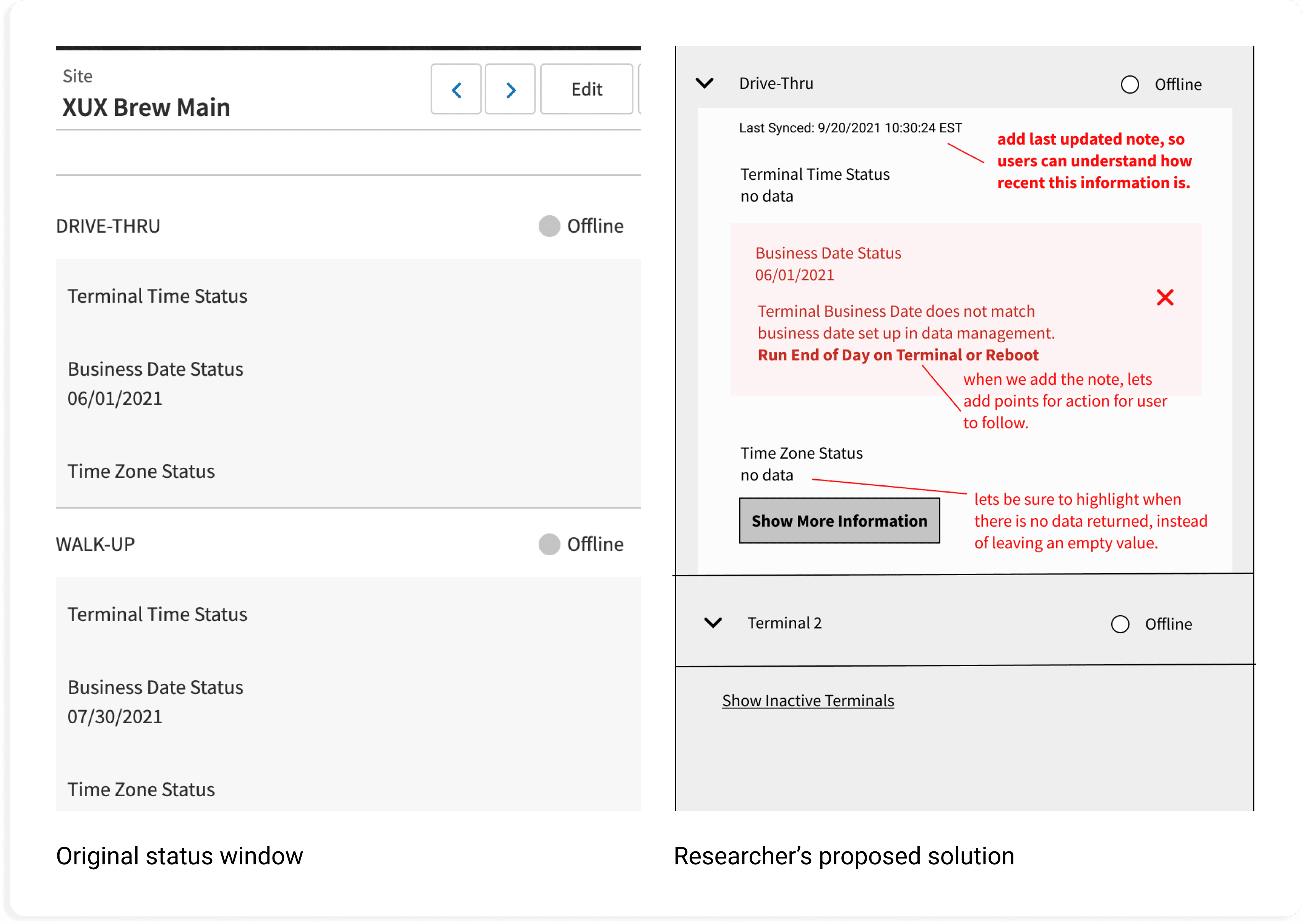

A few new design system assets and we were in business
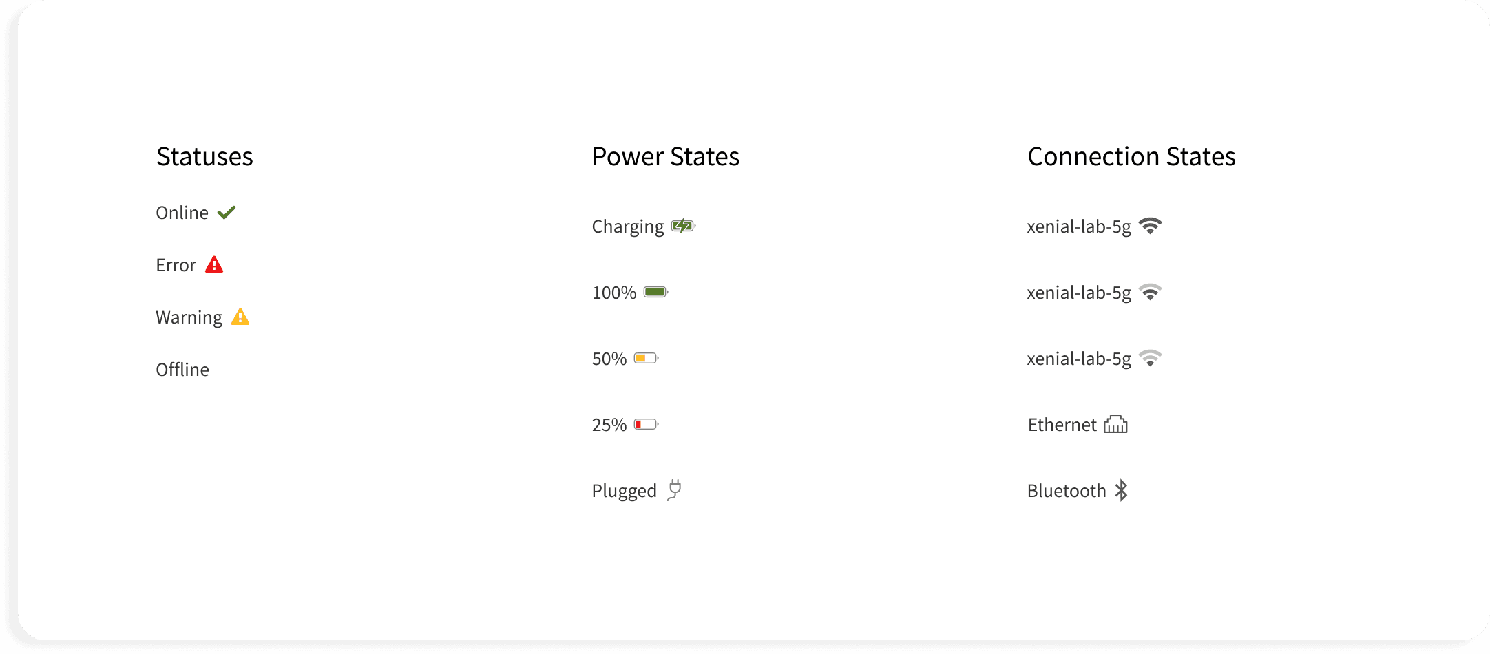
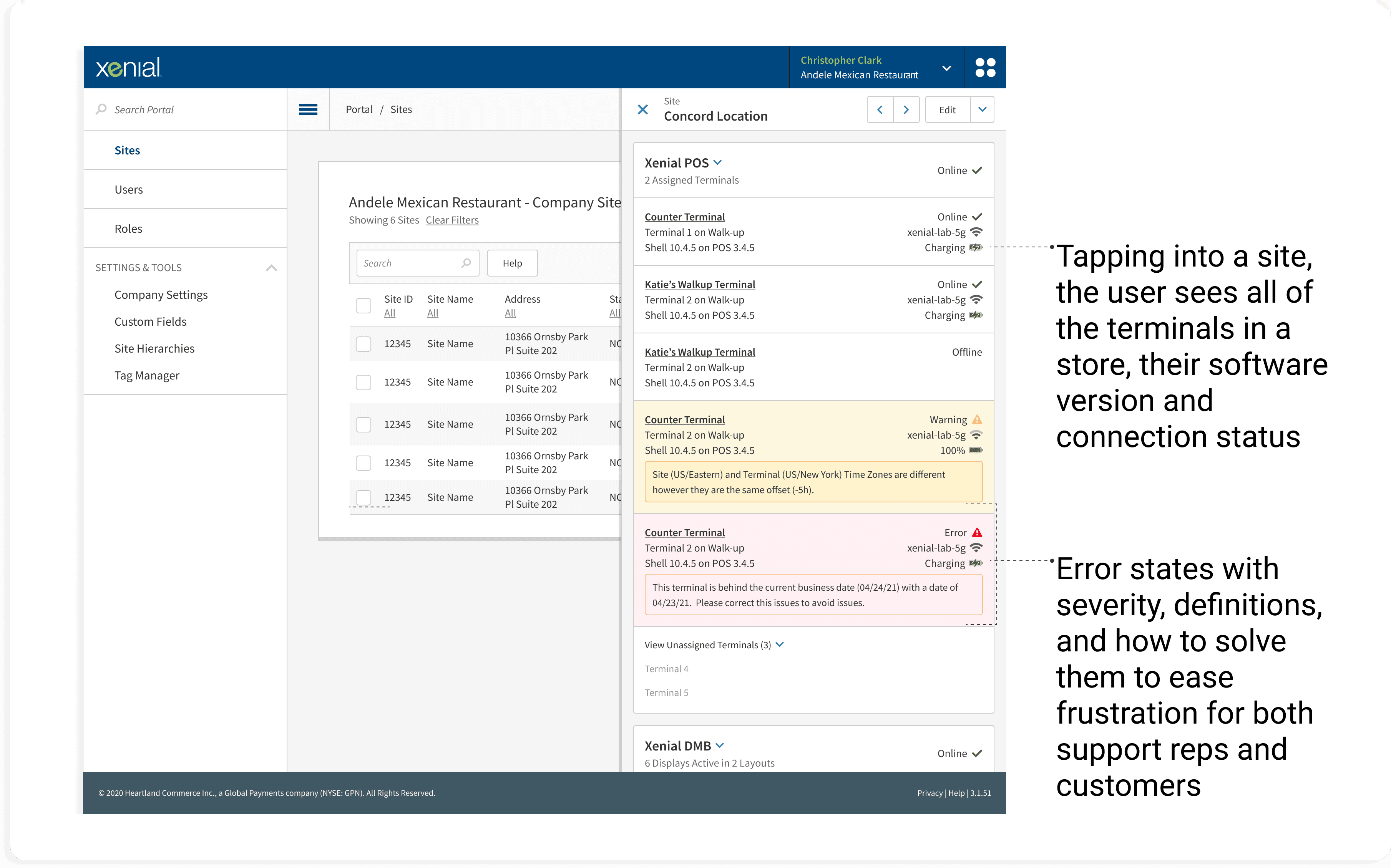
The app uses accordions for progressive disclosure. I used design system patterns to group information using headers to show levels of importance. For statuses, we used recognizable labeled icons for quick scanning.
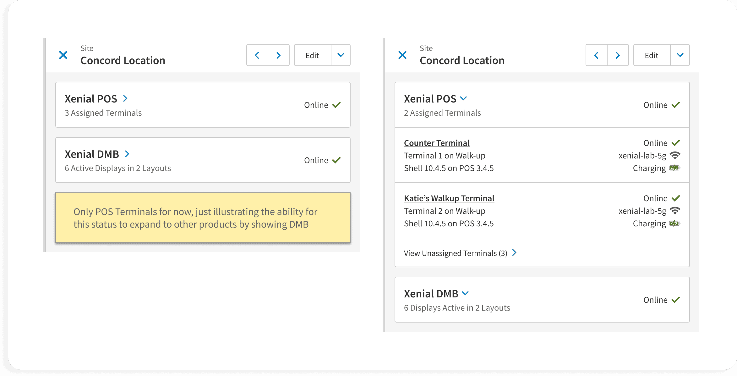
How it works
Errors at a glance
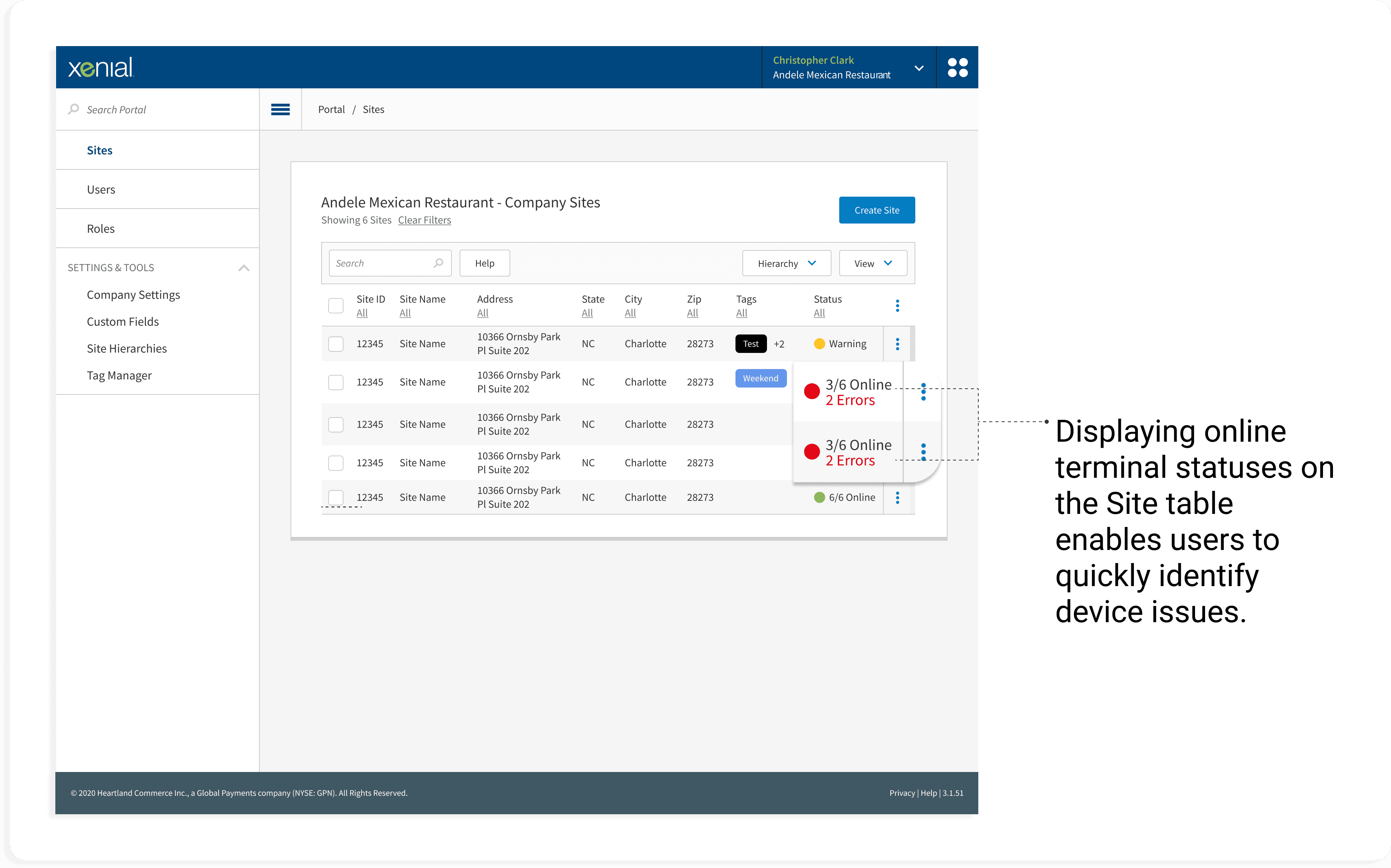
The Site table lists all of a customer’s store locations. Since offline terminals are a common complaint, we added a column to show the number of terminals at a store and their current status, which refreshes every 60 seconds.
Big icons paired with traffic light red, yellow, and green text allow the user to scan to see where problems are quickly, but for accessibility doesn't rely on color alone.
Progressive disclosure and UX copy
Not every error is an emergency, but the support specialist needs to move fast for those that are.
To help developers decide which are critical and which are less severe, I showed examples of each in the mockups and wrote UX copy that explains to the user how to fix the problem.
Retrospective
100% of users feel confident that the new designs will help them to troubleshoot customer POS issues quickly and improve their support metrics.
“This is such a vast improvement over what we currently have. Nice work!”
— Keiley, Xenial Tech Support
