7 months | 2022 | Team of UX Designer, PM, Project Manager, Creative Director
Entering a new vertical with cloud-based PDFs
The client offers secure PDF software for document management and data capture. They've developed a tool for architects, engineers, and contractors to manage documents and files on and off the job site.
A web app for real-time collaboration
My team designed a desktop app that lets users markup, share, approve and collaborate on drawings in real-time without a glut of versions. Like Figma, but for architects!
As the UX Designer, I led on user research, information architecture, wireframes, and prototyping. At the end of the project I was responsible for annotations and developer handoff.
Goals
Users: Users want to find the latest version of a file quickly, collaborate on documents in real-time, and keep track of all changes. Seemingly small revisions can have big consequences.
Business: The client wants to enter the market with a competitive desktop-based tool to help architects, engineers, and contractors collaborate on documents like blueprints and contracts.
Design: We want users to feel at ease when performing complex workflows and confident using a cloud tool for collaboration, especially for government contracts with strict security requirements.
They're still drawing by hand, but do they have to?
Moderated user interviews showed that construction industry pros are accustomed to working with large scrolls of blueprints, printed contracts, and a glut of revisions. Since they frequently move from the office to the job site, important documents risk getting lost.
Below is a snippet from the user interview guide, click here to checkout the rest.

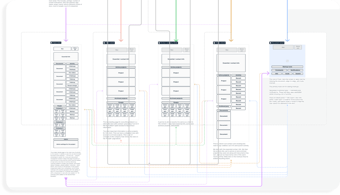
Organizing features based on the PRD and user feedback
Navigation
The client expected this product to be feature-rich. Backed by user research, I pushed for simplicity and introduced structure with targeted and action-oriented navigation.
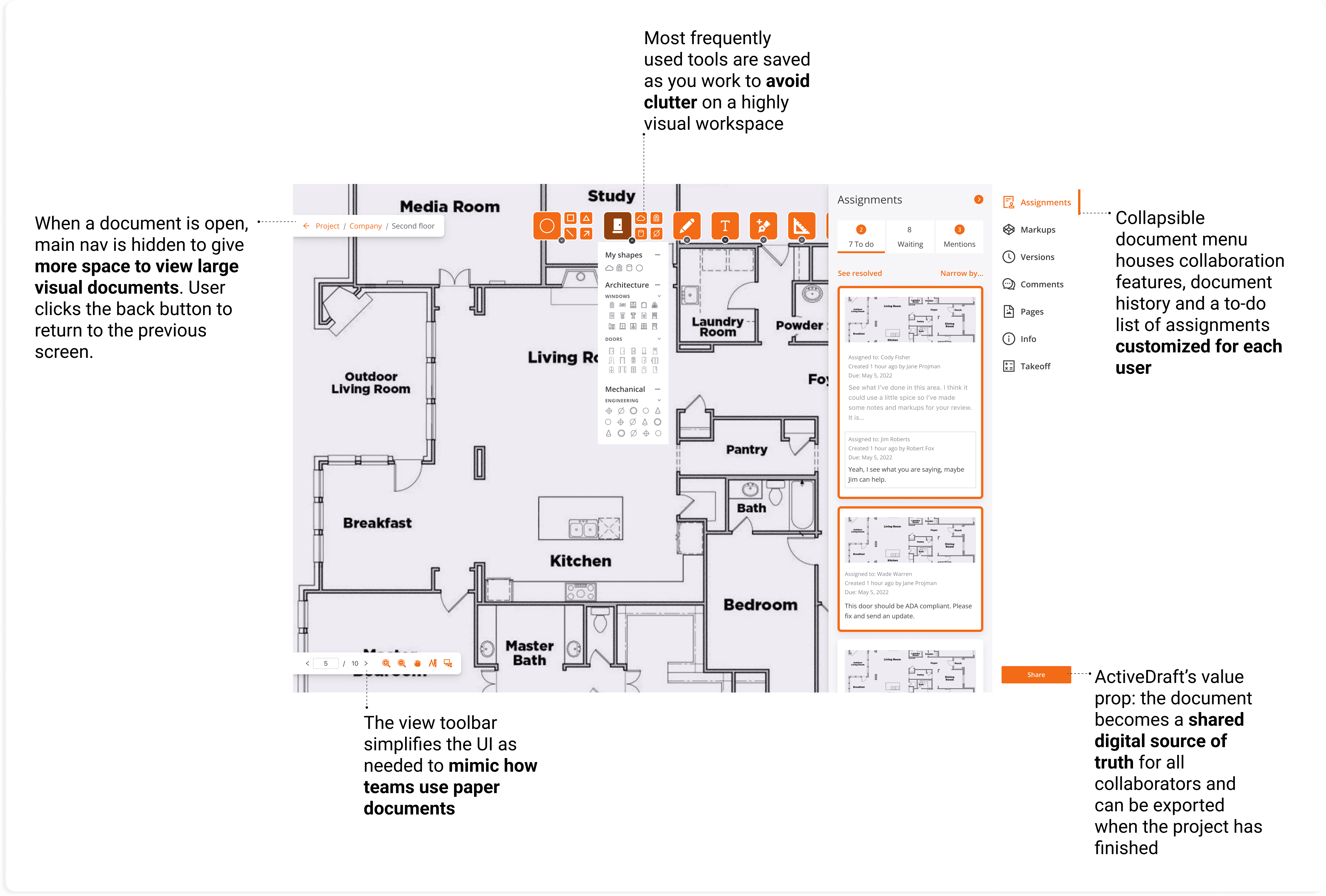
To make features easy to find, we introduced a left-side navigation rail, a collapsible right-side menu for documents, and a visual markup toolbar.

We focused on architects for the MVP, but there were other user groups to account for
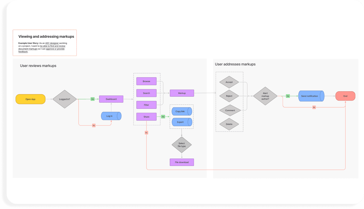
User flows
To make sure we were designing for workflows that made sense for this industry, I took what I learned in the interviews and partnered with client team members who had experience in construction to create 12 user flows.
I referred back to these while designing wireframes, and the user stories I’d written got packaged up as part of the developer handoff

How it works
Navigation and toolbars
We had user research that supported a simple toolbar with a handful of geometric shapes and a smart pen tool that would snap hand-drawn shapes to a grid. The client insisted that we include space for a long menu of architectural symbols. We agreed on a feature that saves frequently used tools to a prioritized list and to revisit this topic after launch to see what real users would lean on intuitively.

File management
File naming conventions are a pain point across most (all?) industries. We needed a solution that would make the most recent version of a document easy to spot. The final flow does this and more with
Drag and drop upload
Files are automatically converted to PDFs
Pre-loaded and user-generated tags to suit the project and team
An optional nudge to tag files as they’re uploaded

Communication
Documentation is critical in this industry. With contracts in the millions of dollars on the line, every change to a blueprint needs to be recorded and traceable.

Retrospective
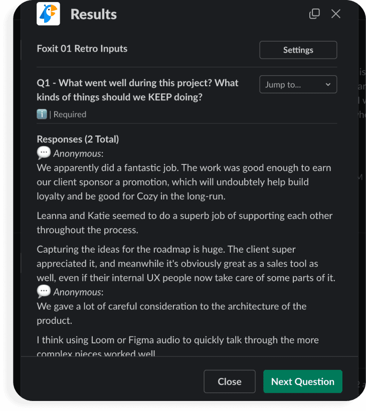
We use a Slack plugin called Polly to collect feedback from the team about how it went. Throughout the project, I documented opportunities for future iterations and provided this list as a final deliverable to the client. We had stuck to the parent brand’s standards, but an eagle-eyed developer called out that, in addition to dark mode, the color palette could be improved for better visibility when the app is used outdoors - I was so focused on desktop use that I didn’t consider this - Teamwork!

